Sixteen-year wedding-industry veteran Julian Leaver is the owner of Julian Leaver Events, a luxury wedding and events planning company based in Dallas. But for the first time in his career, he’s also a groom-to-be! Having now experienced the industry from both sides of the aisle, Julian will be walking D Weddings readers step by step through his wedding-planning process—from his delights, pain points, and decision-making factors as a client to his expertise and know-how as a seasoned professional.
If you’ve been following our wedding planning journey, you’ll remember that last month we talked about choosing entertainment.
We’re continuing our journey this month by diving into all things stationery. How do you choose from the myriad options? And what’s the key to a great stationery suite?
I’ll begin by telling you that stationery is not just insignificant pieces of paper.
Stationery is the foundation of event design—and it holds a surprising amount of significance. So, naturally, you want to make a great first impression.
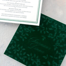
First, think about your stationery requirements. Every couple’s will vary, depending on priorities, plans, and budget. But I think there are a few non-negotiables, including save-the-dates, invitations, and day-of goods (signage, menus, escort cards, etc.).
And remember the “key” that I mentioned before? When it comes to stationery, it’s all about consistency. You want to tell the same “story” all the way through. Because this is your guests’ first look at what’s to come. It sets the tone for your day, complements your wedding vision, and gets people excited!
To tell that story, you’ll want to work with a team of creative professionals who know how to reflect your vision through the stationery details. Francisco and I are working with Southern Fried Paper, as they have a fabulous system of collaboration, and we appreciate their process from concept to design to approval.
Save-the-dates will be the first to go out. These can be more playful and show a bit more personality. In other words, the design doesn’t necessarily have to fall strictly in line with the rest of the stationery, but it’s a nice touch if you can keep some of the same elements. The thread that binds, so to speak.
For example, Francisco and I are using our venue, Hall of Lights, as the thread that ties our stationery together. This gives guests a sense of place and style when they open each invitation. The Hall of Lights is a contemporary concrete venue with cool tones and an airy feel. So we designed our save-the-date cards to bring in elements of that space by creating matte black squares with matte black print and gunmetal gray foil.
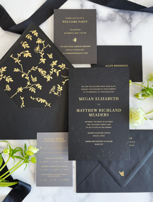
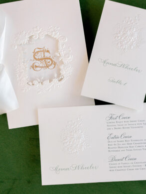
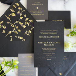
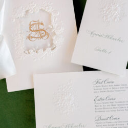
Next up are the invitations, which will generally be more formal than the save-the-dates. But they can still offer a surprise, as our guests will see when they receive theirs! *wink* The sleek, elegant, and modern style of our venue also plays into our invite design, just as yours can.
When designing your invitations, you can also consider color palettes, wedding themes, motifs, formality, and location. Remember, consistency and cohesiveness are key! And perhaps more important than that is the information on the invite. Because if the information isn’t relayed properly, how will your guests know where to go and when? Make sure the practical details are correct!
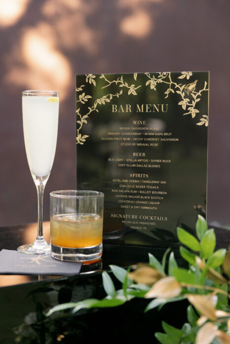
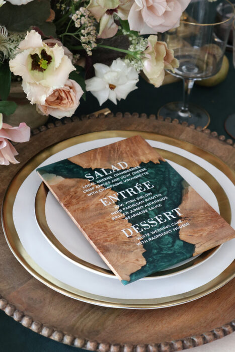
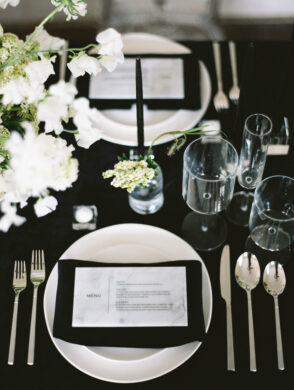
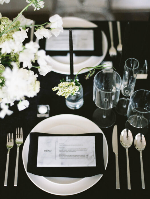
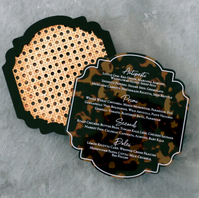
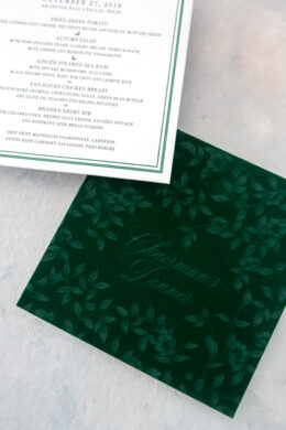
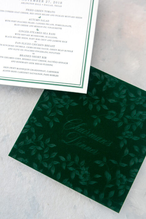
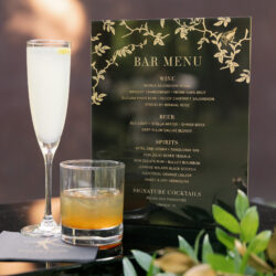
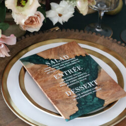
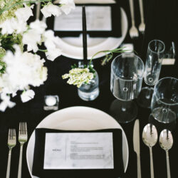
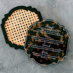
Lastly, the day-of goods should show a little more detail and personality but still have that design thread running through them. Whether it’s the color palette on your napkins or your wedding theme creatively reflected in your signage, you can work with your stationery designer to come up with ways to surprise and delight your guests. You might be surprised at how the little details make a significant impact.
Join us next month as we explore the world of attire and registry.
As always, if you have any questions about your own wedding planning process, I’d love to hear from you.

